Making Graphics To Demonstrate Demographics
The idea for this post came to me recently; the question that popped into my head was - all businesses have a target market, but how obvious is their target market?
My intuition tells me that the placement of KFC restaurants would leave an obvious pattern versus something posher like Farro. But could I prove it? Would it be challenging to find out? Could I come up with a way to elegantly visualise a target market?
This post demonstrates all the interesting analytics you can do on businesses with publically available information.
Note: To international readers, Farro is a premium supermarket, selling much more artisan or niche products than a standard supermarket.
Segments, Markets and People
Whilst almost anything can be used to segment your target market, the more defined your target characteristics, the harder it is to identify your customers accurately. For example, trying to quantify qualities such as a love for rocks is far harder to quantify someones tangible characteristics such as age or income potential.
With how intensely companies like Facebook and Google track you on an individual basis, online businesses experience this less than their physical counterparts as they can lean on data from these types of companies to target their audience. This article, therefore, mostly applies to brick and mortar stores that still rely on a physical presence.
My starting point for this analysis is my good friend, the New Zealand Census. I should be clear; the 2018 census was not without faults; in fact, it had many flaws. However, the datasets I have opted to use are considered ‘High’ in rating.
Can You Census What’s Coming?
To start, we need to identify which businesses I’d like to use as representative of businesses which target lower, middle and upper socioeconomic demographics. To keep things simple, this post will be largely focused on age and population.
My eligibility criteria in selecting this representative sample are as follows:
- One retail store, one supermarket, one hospitality
- Minimum of five stores
Note: In the graphs below, ‘BLW’ means ‘Below Living Wage’. This number in New Zealand is $22.10 per hour which is approximately $44,000 per annum.
Lower Socioeconomic
We’ll start with our representative sample of businesses which target lower socioeconomic demographics. These stores have goods at a lower price point than others.
The businesses that I’ve chosen are as follows: KMart, Pak ’n’ Save and KFC.
Grouped Summary
National Differential
Interesting Findings
- There’s a massive bias towards younger and less affluent people, older people, in general, are less than the national average across the board.
- 46% of the people in these catchments were below the living wage, with another 29% of people earning below $60,000.
Middle Socioeconomic
These stores I consider as fairly ‘generic’, with no significant sway towards luxury or cheaper goods. This one will be much more subjective than lower and upper, so if you disagree, I get it.
The businesses I’ve chosen for this section are Hallensteins, Countdown and Hellz.
Grouped Summary
National Differential
Interesting Findings
- Interestingly, we can see a more significant number of younger people across the board compared to the national average.
- We have a disproportionate amount of less old people that earn less than the living wage.
Upper Socioeconomic
Luxury stores which target the upper socioeconomic demographic are usually self evident by their higher price points and marketing strategies. For this reason, I’ve chosen some fairly obvious ones which are Rodd & Gunn, Farro and Starbucks.
Grouped Summary
National Differential
Interesting Findings
- Like the lower socioeconomic group, you can easily spot the pattern in the representative sample’s demographics.
- There’s a heavy bias towards older, wealthier people and less old, less affluent people.
Methodology

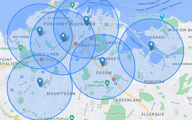
- A collection of addresses were located for each store of the representative sample, a geographic buffer of 2KM was then applied.
- The area of an intersection between a buffered point and a Statistical Area shape is calculated, this value is then applied to the count.
- Overlapping buffer zones is an issue, however, I’ve used percentages rather than nominal values to mitigate this issue.
Summary
If you’ve gotten this far, I hope you’ve come up with some interesting bite-sized insights, if not I leave you with the following:
- Luxury stores tend to place themselves in places where they can heavily target affluent, older people.
- Normal stores have a bias towards younger people as opposed to older people with no preference in income (except those below the living wage)
- Businesses that target lower socioeconomic demographics have a huge bias towards younger people who earn below the living wage.